A Bibliography of Articles & Video About HRBarnhartArt
September Exhibition, "When Matter Talks Back,"
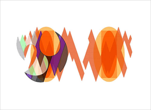
Art Forum with Rebecca Muller and Howard R. Barnhart
Gallery A3/Amherst Art Alliance, Amherst, MA 01002
Art Forum with Rebecca Muller and Howard R. Barnhart
Gallery A3/Amherst Art Alliance, Amherst, MA 01002
Forum Video: https://vimeo.com/1011338180
Text of Statement at Online Art Forum
Each of my compositions takes form around a specific, visual concept. The core concept is best described verbally by a single word that is both noun and verb, thing and action. It becomes the title. While I was developing my current process, I was incorporating animated segments. The results were unsatisfactory to me. I knew the issue wasn’t technical: I have good animation software and could move objects around in the scenes I was compositing without difficulty, but the work itself never seemed compatible with animated effects. It was not at all about smoothly panning and zooming and moving objects around realistically in a visual field. It was about how an entire visual field transforms as a whole from one state to another and how it structures and times the transition. Those goals are much more the province of stop motion. I found conventional stock photos and illustrations naturally lent themselves to this approach and were rich sources of imagery I could composite digitally into scenes. Fortunately, there are now extensive libraries and archives of high quality images online, freely available to download and adapt, millions of images across every conceivable category. Stock imagery usually functions as a background setting for some other project, and that very function of being a conventional background often means well composed stock images are loaded with visual potential, and, when composited, can transform from unobtrusive backgrounds into striking, insightful scenes. After selecting a root concept that embodies both acts and entities, gathering relevant visual resources online and compositing these still images into scenes, I sequence the scenes and then compose transitions between them. I avoid ready-made, mechanical transitions. If an image-scene dissolves into another, I manually compose transitional images between those specific scenes. If an image-scene cracks and fragments to reveal another, I visualize that process by hand such that each transitional image will work in that particular sequence and stand on its own visually. When completed there are usually well over a hundred images in the final sequence, and up to 90% of them are transitional images composed between the scenes I’ve composited from stock imagery.
While I’m developing the imagery, I’m also applying a similar compositing approach to a set of audio tracks to accompany the final image sequence. I remix selected audio tracks in Audacity and master a soundscape to accompany the visuals. Sound and image meet in VideoStudio. I upload videos to my preferred online platforms: to my website at Adobe Portfolio, to Vimeo, YouTube, Behance and Instagram/Threads. The keyword to search is, HRBarnhartArt. I invite you all to visit these sites, and I hope you enjoy browsing through my libraries and playlists.
________________________________________________________________
Constraint Aesthetics | Encoding Process | Algorithms & Nature
Colourist Geometries and Rule-Set Art
Friday, 26 August 2005
Colourist Geometries – Howard R. Barnhart
(Composition 2003no.02)
(Composition 2003no.02)
Howard R. Barnhart (Composition 2003no.02)
Howard R. Barnhart is been producing some exquisite geometric art that’s worth investigation. Using Colorist and Constructivist methods, he has produced a range of work in different mediums that have at times a computational aesthetic. In fact his journals (scroll to bottom of the page) seem to contain references to systems or ‘algorithms’ for the ordering of colors and shapes in his work.
This pulls us over to Sol Lewitt’s maxim ‘The idea becomes the machine that makes the art’. Lewitt worked using sets of instructions to produce geometrically precise paintings and in doing so set a precedent in the area of generative art. Interestingly Nu-school computation artisans have looked at Lewitt’s rule-set methodology as a way of questioning the relevancy of this type of conceptual art to current software-based art.
_______________________________________________________
THE MONTAGUE REPORTER, June 23, 2005
ART REVIEW:
Visual Harmonics at the Center for the Arts
Visual Harmonics at the Center for the Arts
BY LISA DAVOL,* NORTHAMPTON, MA
Rebecca Muller and Rick Barnhart have their fingers on the right vibration. A creative collaboration on their current show, Visual Harmonics: Texture and Rhythm in Color, at the Northampton Center for the Arts moves us through Barnhart’s abstractions of elemental sound, color and geometry to Muller’s use of those same elements to comment on life-experience.
Harmonics is the theory or study of the physical properties of musical sound. In translating musical characteristics, Rick Barnhart visualizes the raw elements of music through his use of color, form and spatial relationship. Emerging inductively, his compositions do not adhere to logic or vision, nor do they suggest a narrative or ideology. They materialize as the composition takes form, guided by the shape of the frame with little reference to life outside of it. Similarly, music employs a set of frequencies within the framework of a key signature, a series of relationships between the notes of a scale. The possibilities are endless within the scale, and in Barnhart’s case, the frame.
Differing frequencies produce color as well as sound and initiate movement when combined in certain multiples. Barnhart’s colors are dynamic – bouncing off one another and moving forward. While keeping within his workspace, he starts with a color-chord and then derives a grid on which his geometric shapes are formed, analogous to the staff on which notes of music are placed in relation to one another. His compositions unfold with each shape building on the last and anticipating the next. On a blue background of contrasting rounded and angled gridded planes, Composition 2002n06a uses geometric shapes of strong color that circle and weave in and out of each other. His mixture of similar and complimentary colors helps to keep the piece in motion along with repetitive and connecting curves. Little evidence remains of the creator, as the lines are sharp and clean, and the application of color almost of machine quality.
His 3D work is comprised of reliefs, layers of shapes and colors shifting in perspective between the layers and the whole. In Composition 2005n01a (1985n09b): First Construction, the focal point is at times the image on the top layer and at other times is the layer’s negative space, shaping the strata beneath. The layers come together like musical chords producing one sound comprised of separate notes.
As an entire work of music cannot be apprehended in an instant, Barnhart’s digital animations unfold chromatically, with colors, grids and lines chronicling each step of the scale from introduction to resolution. Amid the stationary pieces, video monitors show grids with color and shapes emerging on top of each other to the final completed image. Composition 2004n04a is experienced as a piece of music is: gradually, attentively, intuitively.
For Rebecca Muller, color is about surface and matter is about color. The materials she uses are meaningfully shaped by perception and perspective, drawing on human experience and events outside the workspace. Her work is subtle, yet makes a powerful connection to the viewer, suggesting space and atmosphere as well as traces of unidentifiable events, while faithfully remaining abstract compositions.
At first glance and from a distance, Refrangible appears to be a two dimensional painting or drawing. As it is viewed more closely, one can see the complex intersection of lines being formed by part of a wire cage attached to a paper backing with drawn lines to echo the cage. Upon even closer inspection, one can see that some lines are drawn in red and brown, some are of a gray raised material to resemble shadows. Other lines are the actual shadows from the caging appearing only if lighting conditions in the room are sufficient. Clinching the composition in the upper left is a raw element of rusted metal picking up the brownish drawn lines and hinting at the passage of time and its effects on the appearance of objects as they age. The condition of the object will produce a different color and surface– grey and smooth when new and brownish and textured when aged. Her use of repeating squares of caging provides additional pattern and texture to her pieces.
Memories outlive actual events that have taken place and are re-colored as experiences and perspectives change. Firmly Grounded is an enhanced photograph of a sculptural piece Muller created in 1985 of the same name. The photograph reflects its vibrant original colors and its stark black background recalls its elegance. The image is fixed in space and can only be viewed from the perspective of the camera. The actual sculpture is also in this exhibit in its naturally aged form and in new context. The almost 4 ft. high piece stands on the floor and is comprised of three smaller pyramid forms stacked to create a larger pyramid. Made of wire caging, the form is airy and allows one to see inside and through it with a new vision from each viewing angle. Each of its three segments is a different color – yellow, red or white and at points where they overlap the colors and layers float in and out of each other. These colors are faded as the piece was stored outside for several years. Here it now stands in front of another large reworked photograph of itself, but this time in an outdoor landscape. When it is first approached, there is a moment of confusion before the realization that one pyramid is real and one is photographed. The photograph can additionally be seen through the spaces of the sculpture itself. Muller uses her materials to suggest time, memory, sense of place and self reinvention.
Working in an opposite dimension from Barnhart’s interactions of clean edges, solid forms and saturated color, Muller’s mutating colors and surfaces examine evolution and reinvention as part of a constant and changing process. Her work is understated, layered with complexity. Initially more tranquil than the overt color and movement of Barnhart’s pieces, they then take us off guard as they invade our space and challenge our perceptions.
In Visual Harmonics: Texture and Rhythm in Color, Barnhart unleashes color and sets his vibrant geometric creations in motion. Muller then takes the baton and fleshes out the orchestration by harnessing and giving meaning to these raw elements which color our human existence. These artists assert the richness and dynamism under the surface of our textured lives.
Visual Harmonics: Texture and Rhythm in Color is on view until June 28th at the Northampton Center for the Arts, 17 New South St., Suite 303, Northampton.
* Lisa Davol is a frequent arts contributor to the Montague Reporter in Montague, Massachusetts, US. She works to promote economic stability through artisan made products in developing countries.
_______________________________________________________ations. His “Lair,” a 44″ square of black, white, grey and tan colored forms, might be interpreted as an asymmetrically balanced pattern of regular and irregular shapes set against a warmed ground, or a series of regular shapes that overlap each other. It might also be seen as a schematized, modernist interior with a cool light that touches on the poetics of the void. Like all the abstractions here, “Lair” (or does App mean Liar, as all art is, in some ways) can be perceived in a number of ways.
Tim McFarlane’s “Here/There,” on the other hand, is an homage to–or deconstruction of–the stripe, another modernist standard. McFarlane’s three darkly striped, vertical blocks, each a different height and width, abut each other, like city buildings, shoulder to shoulder. The upper quadrant of the panel is left blank and it is alternatively a negative space or a positive shape. Its main function, however, is to focus attention on the striped planes, emphasizing the architectonic divisions within the square and those divisions shifting relationships, shifting alliances.
Vincent Romaniello’s top to bottom vertical stripes are of a different order, alternating between thick and thin, between a range of reds from deep to pale, intercut by Barnett Newman-like “zips” of light and dark. Layered with a gauzy wash of white here and there and splattered by dots and dashes of white, their placement dictated by chance and gravity, Romaniello combines the geometric with a looser, more fluid touch, setting his sequence of bands and stripes into a rhythmically arresting, visually syncopated movement that traverses the surface of his painting.
From stripes the exhibition moves to the grid, arguably the emblematic motif of modernism. Siri Berg’s version of it is executed in oil on linen, a vertical rectangle that reads like a color chart, only much more nuanced. Consisting of a dozen units divided into three rows of four rectangles, the top and bottom rows are graduated shades of luminous grey, warm and cool, that emit a shimmer of light where their edges meet. The center row is yellow, orange, red and a red purple, the hues suggesting a brilliant, rosy-fingered dawn by means of the purest non-objectivity.
“Roza,” Gail Gregg’s meticulously crafted, warm little 12″ grid, is an encaustic painting on panel. Partitioned by vertical bands of salmon pink crossed by thin horizontal lines, the resulting squares are each partitioned again by a lengthwise stripe, then each section is stroked with fine, repeating vertical lines to create an intricately textured ground that flickers in response to light. The surface configuration suggests a textile pattern, a gameboard, an aerial view, things cultivated, crafted by the human hand, created by the human will and imagination. More to the point, “Roza,” like all of the works here, demonstrates a utopian belief in the sense of order, art’s antidote to the chaos and terror of life, a chaos that has reasserted itself time and again, as it does now, in daily catastrophic events.
“Uttar 250,” part of a continuing series by Joanne Mattera, is the most luxuriant painting here, inspired by the colors of India, by traditional Indian miniature painting with its saffrons, roses, vermilions, indigos, emeralds, cinnabars. Also encaustic, its version of the grid consists of three stacks of more or less even strokes of colors which in turn drip paint, like syrup. This is a voluptuous painting, its grid about to melt down, it seems, into pure, irresistible paint.
Julie Karabenick, on the other hand, takes the constructivist grid and explodes it. Using a lexicon of only squares and rectangles, beginning with a square module within a square field, Karabenick varies the dimensions of these basic shapes, her practice intent on proving the infinite diversity of purposeful limitation. The colors are flat, restrained but when juxtaposed, create their own scintillation. Through a system of carefully calculated color interactions, a kind of optical chain reaction, Karabenick’s pixellated pointillism gives a new spin to dynamic equilibrium.
Both Christine Vaillancourt’s “Matter Data III” and W.C. Richardson’s “Cold Reasons” are strikingly patterned. Vaillancourt delimits the frontal plane of her painting with four cleanly contoured rectangles of white or black that obscure what is behind them. They are painted over a crowd of smaller black, white and colored circles, ovals and squares that surround them, floating in an indeterminate spatial field. Layered and overlapped to create an illusion of space, Vaillancourt’s geometries have drift and buoyancy.
Richardson’s alkyd painting, on the other hand, is a tightly ordered square, its outermost plane fixed by four vertical rows of opaque white dots. Behind them appears a crackled, porous, red-brown drawing that resembles a cross section of a plant, say. Then there are an interlocked series of angled, double-lobed shapes placed like stylized leaves on a stem, one in black, the other white, reversing between image and ground, positive and negative, surface and depth; they could also read as a flat, biomorphic design in the same plane. However they are decoded, Richardson’s dialectically constructed painting elegantly presents a number of perceptual conundrums.
The last four painters are more difficult to group. Howard R. Barnhart’s work is a relief, the shapes cut-out and layered. However, it is the chromatic contrast and interaction that interests him most, the weight and measure of one color against the other that determines the shapes and structural integrity of the construction. Barnhart’s “Composition” a joyously colored, interlocked puzzle of pastels, recalls a sculpture as much as a painting, and as such, more literally realizes the structural engagement that is the theme of this exhibition.
Majorie L. Mikasen’s painting, “Rasa 3” ( rasa is Hindu for “the essence of”), is what the artist calls a “stereopair,” defined as a “side-by-side image that is meant to be viewed using free vision or cross-eyed vision.” Part of an ongoing series, “Rasa 3,” evenly divided into two sections, gives us a pair of images to focus on and merge, their translucent architectonic structures based on a profusion of rectangles and triangles. Rising against a field that is partially patterned with curvilinear forms, “Rasa” suggests a schematic plan for a futuristic complex and demonstrates Mikasen’s deep involvement with the physiological and psychological processes of perception.
Cecily Kahn’s lilting painting, “Bind,”differs from most of the other works in this show in its softness and tempered geometry. Less hard-edged and analytical, its composition is more intuitively arrived at, spontaneous, looser in assembly. It has a beguiling insouciance, as well as the look of collage and montage, its shapes irregular with a mix of textures, patterns, marks and strokes. Kahn says she likes to combine the geometric with poured images and more organic, naturalistic forms which, for her, reflect the dichotomies of urban life.
Laurie Fendrich’s tautly conceived oil painting, “Jeanie,” with its distinctive palette of artificial colors and faultless surface, is based on a vocabulary of geometric forms with numerous art historical inferences, if not quite references. In this particular painting, a rakish, double oval–a kind of barbell on its side–suggests a female silhouette balanced by a rather bulbous shape that might read as a vessel or a mirror, an escaped “genie” or a nod to Picasso’s “Girl in the Mirror.” Beneath are a scattering of rectangles broken down into bands of different colors, designs that look like a color key to the painting, emphasizing, as this show does throughout, that painting–whatever else it is–is still formal, an invention, a specific arrangement of color, line, shape, light, movement and space that is, for those who love it, irreplaceable.
* Lilly Wei is a New York-based independent curator, essayist and critic who writes for several publications in the United States and abroad. A frequent contributor to Art in America, she is also a contributing editor at ARTnews and Art Asia Pacific.
_______________________________________________________
Maine Sunday Telegram review, February 8, 2004
Exhibit raises old question, clouds answer
By BOB KEYES*, Portland Press Herald Writer
Copyright © 2004 Blethen Maine Newspapers Inc.
A new exhibition at the University of New England energizes an endless debate that focuses on the blurry line dividing fine arts and crafts.
The Maine Crafts Association “20/20 enVision” exhibition showcases the work of 40 Maine artists in a variety of media, from cashmere to cotton, tea bags to Tyvek. There are chairs to sit on, mirrors to look in and bowls to serve from. But the vast majority of objects are purely nonfunctional and exist strictly for aesthetic purposes.
All of which raises the question: Is it art or is it craft?
The artists involved answer that question with a question: Who cares?
“I don’t know if it really matters or not whether it’s art or craft,” says Portland glassblower Ben Coombs, whose red and blue glass buoys speak to his sense of color, form, design and technique – the very attributes that distinguish great painters, sculptors and other fine artists.
“In good art, there is a certain amount of craft. And a lot of time there is art to the design of craft. If you ask 20 different people, you would get 20 different answers, so I try not to have that conversation with too many people, because it goes in circles. You can make arguments both ways, and they’re both good arguments.”
The strength of the show is grounded in the pure beauty and whimsy of the pieces, says Anne Zill, director of the UNE Art Gallery.
“Make no mistake, this is a fine arts show,” says Zill. “People who go on rants about what is and is not fine art are behind the times. These days, the quality of the artist is what matters most.”
“20/20 enVision” suggests the quality of the artists has rarely been higher in Maine. This show is an exquisite display of fine craftsmanship, refined critical thinking and masterful technique, said Gael M. McKibben, executive director of the Maine Crafts Association.
An association committee selected 20 established Maine artists for the exhibition, then asked each to pick an emerging artist whose work reflects the high standards of Maine crafts while pushing the boundaries of innovation and skill. The result is an energetic mix of artists of various ages, styles and backgrounds.
The established artists are among the best known in Maine: jewelers Sam Shaw and Tim McCreight, wood turner Jacques Vesery, furniture maker Duane Paluska, basket maker Lissa Hunter and sculptor Lynn Duryea. Among the up-and-comers are clay sculptor Ray Chen, textile artists Amy Putansu and Pam Slaughter, installation artist Lihua Lei and sculptor Pia Walker.
McKibben expects the show will accomplish at least two goals: solidify Maine’s standing as an exceptional state for innovative and cutting-edge contemporary and traditional crafts and settle as irrelevant the art-vs.-craft argument.
“This show very nicely further fogs the line between art and craft, and that is part of the point of the show. We would simply like people to view this as an arts show.”
Writing in the catalog that accompanies the exhibition, longtime Maine arts writer Carl Little observes, “While gains have been made in terms of wider recognition, some critics and observers continue to believe that there is a line dividing craft and art – and that never the twain shall meet. Ah, but viewing the pieces in this exhibition confuses that tidy perspective. Much of the work defies the traditional categories of art and craft or turns them upside-down.”
The best example might be the work of Howard R. Barnhart, a Tenants Harbor resident who works with mixed media. His piece has three elements: a wall-hung, three-dimensional abstract geometric form, painted with acrylic. Next to it on a desk is a computer monitor that replicates the image in various configurations and colors, constantly changing and evolving. And next to the computer is a panel of framed digital prints of those images.
Vesery, a Damariscotta wood turner, nominated Barnhart because of his “fearless use of color (and) content. … It is architectural artistry from concept to completion, taking us on a journey through a cycle of life. We are guided by reason in the depths and soul of each piece as if watching a great orchestration or the construction and decomposition of a monument of time.”
Zill placed the piece close to the front door because it’s eye-grabbing and beautiful, and also to send a message. A computer screen and computer-generated digital prints might be the last things people expect to see at a craft show, she says. “People coming in with expectations for craft are forced to deal with it in its ultimate dimension,” she says.
*Staff Writer Bob Keyes can be contacted at 791-6457 or at: bkeyes@pressherald.com
___________________________________________________
Harbor Square Gallery Highlights Rick Barnhart’s Work
Preview! page 6 June 5-11, 1989
by Lynda Clancy*
In their rawest form, Rick Barnhart’s geometric abstractions are simple cuts of plywood pieced together to create what one Critic has called “the dance of patterns.”
But add to his patterns, strong colors, an even stronger intellect, and artistic sensibilities, and one sees-not painted plywood-but very powerful visual music.
Handsprings 6, A Creation Celebration, a new show at the Harbor Square Gallery on Bayview St. in Camden, features works of several artists (Rachel Schiro, Jean Richardson, Imero Gobbato, to name a few), and highlights Barnhart’s geometric abstractions.
Each of Barnhart’s pieces is unique- from “Triptych: Seven Variations on a Four-Pattern Theme, Three Movements” to “Variations on a Four-pattern Theme, Two Movements.”
Some are delicate and flowing, others arc jumbling dissonance. Yet with all, the connection between color, music, and human emotion is apparent.
For Barnhart, each pigment can be considered an instrument. He concentrates on tuning his colors to their full potency, and coordinating his patterns so the viewer is able to see and feel the work’s rhythm -its vibration, and music.
Barnhart’s concentration on geometric color abstraction developed from an earlier emphasis on Cubism and Surrealism. A Bowdoin College and Tufts University School of Medicine graduate, Barnhart initially intended to enter the medical profession.
However, not long after becoming a doctor, Barnhart made the decision to live his life as a visual artist. He then attended the School of the Museum of Fine Arts in Boston for four years, and now lives in Tenants Harbor with his wife, who is a Rockland attorney, and their two children.
*Belfast resident Lynda Clancy is co-owner In-House Typography and a free-lance writer and photographer.
_______________________________________________________
PAINTING IN A CORRIDOR OF DOORS:
COLOR ABSTRACTION
COLOR ABSTRACTION
Commentary and Review of “Color & Geometry:
Recent Works by Andy Syrbick and Rick Barnhart”,
Harbor Gallery, University of Massachusetts, Boston,
October 1988
Recent Works by Andy Syrbick and Rick Barnhart”,
Harbor Gallery, University of Massachusetts, Boston,
October 1988
by David Raymond*
Andy Syrbick and Rick Barnhart use systems of structure In their paintings which seem at first glance to regulate the character of their work. However, regulation sounds bureaucratic and unfeeling, and the work in this show is neither of those things. The sense of regulation is dismissible as the evidence of their work slowly exposes a more complex and intimate involvement in their approaches.
How can painting, which relies on such cool devices as carefully painted stripes, and grid formats carry any kind of human heat? How does this work “get personal?” Imagine the situation of finding yourself in a very long corridor with many turns and lined on either side with closed doors. Certainly this is not a new image, writers and filmmakers have used it often, because it is provocative for its mysteriousness and its requirement for choices. Even though the corridor and its doorways are a regular structural system you are not going to find any rules, which will tell you what to do in the corridor. You will have to act on your own.
You choose the third door on the left. It opens to another corridor. More doors. You enter and move along stopping at a low door and move again to a very narrow blue door and turn the handle. The door opens slowly, but with resistance. You push and strain. You enter a small room shaped like the letter ‘1’ and walk to another door barely visible in the shadows. You open that door and find still another corridor, more doors. Are you making progress? What is the value of this activity? Who knows? Regulation leaves off and something more peculiarly personal enters this situation. The trail of movements and actions and judgments created by you in this context becomes a product of you more than a product of the system.
Now imagine that, as you move through this corridor sometimes smoothly and reassured and sometimes awkwardly and uncertain, you also realize that you are inventing the corridor ahead of you as you proceed through it. You also realize that even as you invent you also surprise yourself with what you invent. You enter a room with a red door and find a table in the middle of the room. On the table there is a deck of cards. You shuffle the cards. You deal a hand. You study it. You arrange it. Formal abstraction encompasses such an act of invention. As a visual art form it is also an exposed act of invention. The painter establishes a context for response, judgment, choice and action. The elements in the context are formal: color, edge, color-edge, shape, size, surface and so on. (“And so on” is lots of doors.) Because the formal elements are abstract they are the final points of mediation between the inner experience of the painter and the entering experience of the viewer. The painter brings the viewer through the corridor to the cards.
Syrbick and Barnhart are not overtly self-expressive or self-exposed. That is, they do not make self-expression an emphatic feature. They share an interest in fully realized, integrated paintings. They are dedicated to the fullness of the fabric of their paintings. A conversation with either of them inevitably reveals a concern for finding the best resolution in particular works. But these are not simply “best resolution” paintings.
Always under the enterprise of invention, there is a kind of restless pulse, a voice inside the behavior of inventing that asks an insistent question, “what if…” Formal abstraction has had as part of its tradition a stripped down quality. It reveals the act of asking that question and it reveals the choices offered as answers. Any time that such revelations are clear we have an opportunity for intimate contact with the human being who has become so revealed.
Barnhart cuts a contour and sets it against another contour. He keys his color quite carefully, but he nudges it, sometimes abruptly from earth-deep and wine-like color to paler memories composed with a sense of expansion and luxury. They are paintings loaded with ambition and an interesting internal contradiction. Although they use curves, the colors themselves are not delivered as curves. The colors are premised through straight lined striped systems and the systems are in a sense “detonated” by the arcing edges that pierce space to give them location. This is the passion of this work, the restless pulse.
Syrbick’s pulse is more directly from the body. Less involved with composing space, his work tends toward its meditative center, letting color vibrate in and out of the center or ripple across the space. Using deceptively simple structural formats, he seems to have magnetized color and sets up nervous attractions that have an electric and anatomic “feel.” Although there is a field quality to Syrbick’s paintings, this sense of a center or even a core keeps coming through. There is an exotic creature implied beneath the mentality of these paintings.
When you leave the room with the red door, you see that there is a small nameplate on it just below eye level. It reads Cézanne.
*David Raymond is an artist, teacher, gallery director, and critic living in the Boston area.
________________________________________________________
The Mass Media, October 25, 1988
ARTS AND FEATURE
Color it Energetic at the Gallery
Color it Energetic at the Gallery
by Kathleen Vejvoda*
If you want to see color in all its raw, unfettered energy, stop by the Harbor Gallery and catch “Color And Geometry: Recent works by Andy Syrbick and Rick Barnhart,’’ an eye-catching exhibit featured through November 8.
Andy Syrbick and Rick Barnhart are two Boston area artists whose recent work is characterized as geometric abstraction. This kind of abstract geometrical art may not draw an intimate response from every viewer, but through their pattern and color contrasts, these works create an immediate sensory upheaval. There is integration in these paintings, and yet they hum with a kind of restless energy.
Rick Barnhart’s compositions, often done on multiple planes, focus on the geometric interplay of space, form and shadow. His structures, with their many surfaces and contours, are not only complex in form but also startling in their contrasting colors and patterns.
Barnhart’s 1988no.13: Three-Plane Relief has at least four strikingly different patterns juxtaposed on its top plane. Small patterns of lilac and orange stripes are contrasted with larger grids of dark wine and russet, and the shadows created by the multiple planes seem to set the whole structure into a rhythmic movement.
Many of Barnhart’s works set up tricky oppositions that are hard to notice at a glance, because of the unity of adjoining patterns. For example, 1988no.8, 1988no.9 and 1988no.11, two or more structures face one another and appear at first to be completely symmetrical or identical because the same colors and patterns are used in each. But a closer look reveals that the shape of each structure is drastically different.
Barnhart is not only concerned with the composition of space, but also with the precision and tuning of color. The colors of each pattern are carefully chosen, and then these patterns are defiantly contrasted. Therefore, in 1988no.6: Three-Pattern Composition, a brooding black, army green and red pattern neighbors a crisp pink, blue, and light green one, with a soft pattern of pastel peach, gray and white thrown in for even more definite contrast.
Barnhart’s use of shadows is very important, because it adds to the wholeness and depth of the work. The natural shadows created by his reliefs are not incidental, but are a deliberate aspect of his art. As a result, 1988no.14: Three-Plane Relief casts clusters of shadows on the gallery wall that fan out behind and underneath it like a cape, and 1988no.12 is beautifully framed by its own geometric hexagonal shadows.
Andy Syrbick’s primary interest is the expressive potential of color, and the effect that various geometric forms, patterns and rhythms can have on our perception of color. Syrbick’s paintings exude a remarkable clarity and vividness of color, releasing the inherent energy and character, which he feels colors possess in their raw or primitive state, unshackled by our everyday associations. Syrbick feels that geometric abstraction is more useful than organic form when exploring color perception, because it does not overshadow or restrict the independent energy of the color.
In almost all of Syrbick’s paintings, there is a sense of center, directness toward the core. The other colors rivet across the field or vibrate in and out of the center, pulling us toward the powerful color in the middle.
Anyone who appreciates the power of color will enjoy this exhibit. Experience color at its energetic best at “Color And Geometry: Recent Works by Andy Syrbick and Rick Barnhart,” featured through November 8 at the Harbor Gallery.
*Kathleen Vejvoda is Visual Arts Critic for The Mass Media
____________________________________________________
THE DANCE OF PATTERNS
Commentary by William Holshouser*, October 1985,
For Interdisciplinary Exhibition/Performance by Blue Masque,
Episcopal Divinity School/Weston School of Theology
Cambridge, Massachusetts, USA
For Interdisciplinary Exhibition/Performance by Blue Masque,
Episcopal Divinity School/Weston School of Theology
Cambridge, Massachusetts, USA
Looking at Rick Barnhart’s recent paintings-colorful, geometrical abstractions in acrylic-I first notice vibrancy. Surface textures vary. Lines are clean, colors alive, compositions active and graceful.
Next I see patterns and interactions. In each painting, two, three or four patterns share the field, overlapping and intercutting. Each pattern has its distinctive geometry. Single patterns tend to be chords of variation on a basic color. Across patterns, however, contrasts are high, as if a number of movements that would like to be mutually exclusive are contending for dominance of the painting.
This sense of interaction is no accident. When Barnhart talks about particular paintings, it’s clear he’s not only the artist, but also something of a referee and orchestra conductor. He describes the paintings as improvisations that begin as a power struggle among patterns, but which end-if they are successful-as something like a dance. Barnhart’s ambition is not to bring a painting to equilibrium, but to bring it to harmony. “If you make all the moves that can be made, the painting goes dead,” he says. “If you stop at the right time, there’ll be movement left for the viewer’s eye to add.” Patterns that the eye sees first as background pop out as foreground. Patterns reach out in swirls and clusters from the areas they control, send out island colonies, stretch themselves into points and bulbs.
The compositions also carry what I took at first to be an indefinable sense of portent, of significance. Later, talking to Barnhart, I decided that this feeling is related to the theoretical foundations of the paintings, and is in fact not only definable but even, in an important sense, moral.
Barnhart thinks of these paintings as “dialectical”-not in the resolved Hegelian sense of thesis/antithesis/synthesis, but more in Kant’s sense of human reason striving to discover universal laws and to make them concrete in living. He begins a painting by establishing the geometric patterns. Each is an “idea” that, unchecked by other ideas, might rule the whole space.
Each idea is “legitimate” and helps determine the shape of the whole. (The borders of the paintings often take on the geometry of the patterns they contain. As a result, the paintings are not rectangular windows showing a scene in some other place, but events occurring here and now, in the viewer’s time and space.)
Barnhart “improvises” a painting by choreographing the dance of patterns, with particular attention to points of intersection. To return to the analogy of ideas, he lets each idea assert its legitimacy but does not let it dominate the field. The result-the painting-is a dynamic situation created by the assertion and exchange of ideas, a mathematical (geometric) model of “practical reason” concretizing a law.
Social relevance is in the tradition of geometric abstraction. In the teens and twenties of this century, the de Stijl movement, centered in Holland, saw art as a model of universal harmony attainable by humanity freed from individualism and materialism. After the Holocaust, living in nuclear stalemate, we are skeptical of the tendency of idealism to turn to ideology–but are also much in need of models of mutual respect and coexistence. Barnhart’s paintings are a more modest message from the world of art, one appropriate to our decade.
A final word about color. Barnhart has been exploring analogies between color and music for years-another notion with deep roots in the work of past geometric abstractionists. In these paintings he considers the choice of pigments as the “orchestration” of the painting, comparable to the choice a composer makes in deciding which instruments will play a particular piece of music. Gradations of light and dark are chosen by analogy with the intervals of the musical scale, creating the tonal harmony between contrasting patterns.
After hearing about all these theoretical roots, I went back and looked at the paintings again, half afraid that they would now feel didactic or contrived. To my surprise, they seemed deeper. To be sure, they are mathematical, but in much the same way as Bach’s music. Their order makes their spontaneity more apparent, not less.
*William Holshouser is a poet and social scientist living in Cambridge, Massachusetts.